Lets-Plot for Kotlin を使用したデータ可視化
Lets-Plot for Kotlin (LPK) は、R の ggplot2 ライブラリ を Kotlin に移植したマルチプラットフォーム・プロットライブラリです。LPK は、機能豊富な ggplot2 の API を Kotlin エコシステムにもたらし、高度なデータ可視化機能を必要とする科学者や統計家に適したツールとなっています。
LPK は、Kotlin Notebook、Kotlin/JS、JVM の Swing、JavaFX、および Compose Multiplatform を含む様々なプラットフォームをターゲットとしています。さらに、LPK は IntelliJ、DataGrip、DataSpell、および PyCharm とシームレスに統合されています。
このチュートリアルでは、IntelliJ IDEA の Kotlin Notebook を使用して、LPK および Kotlin DataFrame ライブラリで様々な種類のプロットを作成する方法を説明します。
開始する前に
Kotlin Notebook は Kotlin Notebook プラグイン に依存しており、これは IntelliJ IDEA にデフォルトでバンドルされ、有効になっています。
Kotlin Notebook の機能が利用できない場合は、プラグインが有効になっていることを確認してください。詳細については、環境のセットアップ を参照してください。
Lets-Plot を使用するための新しい Kotlin Notebook を作成します。
File | New | Kotlin Notebook を選択します。
ノートブックで以下のコマンドを実行し、LPK と Kotlin DataFrame ライブラリをインポートします。
kotlin%use lets-plot %use dataframe
データの準備
ベルリン、マドリード、カラカスの 3 都市における月平均気温のシミュレーション数値を格納する DataFrame を作成しましょう。
Kotlin DataFrame ライブラリの dataFrameOf() 関数を使用して DataFrame を生成します。以下のコードスニペットを Kotlin Notebook に貼り付けて実行してください。
// months 変数は、1年間の12ヶ月のリストを保持します
val months = listOf(
"January", "February",
"March", "April", "May",
"June", "July", "August",
"September", "October", "November",
"December"
)
// tempBerlin、tempMadrid、tempCaracas 変数は、各月の気温値のリストを保持します
val tempBerlin =
listOf(-0.5, 0.0, 4.8, 9.0, 14.3, 17.5, 19.2, 18.9, 14.5, 9.7, 4.7, 1.0)
val tempMadrid =
listOf(6.3, 7.9, 11.2, 12.9, 16.7, 21.1, 24.7, 24.2, 20.3, 15.4, 9.9, 6.6)
val tempCaracas =
listOf(27.5, 28.9, 29.6, 30.9, 31.7, 35.1, 33.8, 32.2, 31.3, 29.4, 28.9, 27.6)
// df 変数は、月ごとの記録、気温、都市の3つのカラムを持つ DataFrame を保持します
val df = dataFrameOf(
"Month" to months + months + months,
"Temperature" to tempBerlin + tempMadrid + tempCaracas,
"City" to List(12) { "Berlin" } + List(12) { "Madrid" } + List(12) { "Caracas" }
)
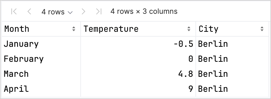
df.head(4)DataFrame には、Month(月)、Temperature(気温)、City(都市)の 3 つのカラムがあることがわかります。DataFrame の最初の 4 行には、1 月から 4 月までのベルリンの気温の記録が含まれています。
LPK ライブラリを使用してプロットを作成するには、データ(df)をキーと値のペアでデータを格納する Map 型に変換する必要があります。 .toMap() 関数を使用して、DataFrame を簡単に Map に変換できます。
val data = df.toMap()散布図の作成
LPK ライブラリを使用して Kotlin Notebook で散布図(scatter plot)を作成しましょう。
データが Map 形式になったら、LPK ライブラリの geomPoint() 関数を使用して散布図を生成します。X 軸と Y 軸の値を指定したり、カテゴリとその色を定義したりできます。さらに、必要に応じてプロットのサイズや点の形状をカスタマイズすることも可能です。
// X軸とY軸、カテゴリとその色、プロットサイズ、プロットタイプを指定します
val scatterPlot =
    letsPlot(data) { x = "Month"; y = "Temperature"; color = "City" } + ggsize(600, 500) + geomPoint(shape = 15)
scatterPlot
結果は以下の通りです。

箱ひげ図の作成
データを箱ひげ図(box plot)で可視化してみましょう。LPK ライブラリの geomBoxplot() 関数を使用してプロットを生成し、scaleFillManual() 関数で色をカスタマイズします。
// X軸とY軸、カテゴリ、プロットサイズ、プロットタイプを指定します
val boxPlot = ggplot(data) { x = "City"; y = "Temperature" } + ggsize(700, 500) + geomBoxplot { fill = "City" } +
    // 色をカスタマイズします
    scaleFillManual(values = listOf("light_yellow", "light_magenta", "light_green"))
boxPlot
結果は以下の通りです。

2D 密度プロットの作成
次に、ランダムデータの分布と集中度を可視化するために、2D 密度プロット(2D density plot)を作成しましょう。
2D 密度プロット用のデータを準備する
データを処理し、プロットを生成するための依存関係をインポートします。
kotlin%use lets-plot @file:DependsOn("org.apache.commons:commons-math3:3.6.1") import org.apache.commons.math3.distribution.MultivariateNormalDistributionKotlin Notebook への依存関係のインポートに関する詳細については、Kotlin Notebook のドキュメントを参照してください。
以下のコードスニペットを Kotlin Notebook に貼り付けて実行し、2D データポイントのセットを作成します。
kotlin// 3つの分布に対する共分散行列を定義します val cov0: Array<DoubleArray> = arrayOf( doubleArrayOf(1.0, -.8), doubleArrayOf(-.8, 1.0) ) val cov1: Array<DoubleArray> = arrayOf( doubleArrayOf(1.0, .8), doubleArrayOf(.8, 1.0) ) val cov2: Array<DoubleArray> = arrayOf( doubleArrayOf(10.0, .1), doubleArrayOf(.1, .1) ) // サンプル数を定義します val n = 400 // 3つの分布に対する平均を定義します val means0: DoubleArray = doubleArrayOf(-2.0, 0.0) val means1: DoubleArray = doubleArrayOf(2.0, 0.0) val means2: DoubleArray = doubleArrayOf(0.0, 1.0) // 3つの多変量正規分布からランダムサンプルを生成します val xy0 = MultivariateNormalDistribution(means0, cov0).sample(n) val xy1 = MultivariateNormalDistribution(means1, cov1).sample(n) val xy2 = MultivariateNormalDistribution(means2, cov2).sample(n)上記のコードにより、
xy0、xy1、xy2変数に 2D(x, y)データポイントの配列が格納されます。データを
Map型に変換します。kotlinval data = mapOf( "x" to (xy0.map { it[0] } + xy1.map { it[0] } + xy2.map { it[0] }).toList(), "y" to (xy0.map { it[1] } + xy1.map { it[1] } + xy2.map { it[1] }).toList() )
2D 密度プロットを生成する
前のステップの Map を使用して、2D 密度プロット(geomDensity2D)を作成します。データポイントと外れ値をより適切に可視化するために、背景に散布図(geomPoint)を重ねます。scaleColorGradient() 関数を使用して、色のスケールをカスタマイズできます。
val densityPlot = letsPlot(data) { x = "x"; y = "y" } + ggsize(600, 300) + geomPoint(
    color = "black",
    alpha = .1
) + geomDensity2D { color = "..level.." } +
        scaleColorGradient(low = "dark_green", high = "yellow", guide = guideColorbar(barHeight = 10, barWidth = 300)) +
        theme().legendPositionBottom()
densityPlot
結果は以下の通りです。

次のステップ
- Lets-Plot for Kotlin のドキュメントで、より多くのプロット例を探索してください。
- Lets-Plot for Kotlin の API リファレンスを確認してください。
- Kotlin DataFrame および Kandy ライブラリのドキュメントで、Kotlin を使用したデータの変換と可視化について学んでください。
- Kotlin Notebook の使用方法と主な機能に関する追加情報を見つけてください。