使用 Lets-Plot for Kotlin 進行資料視覺化
Lets-Plot for Kotlin (LPK) 是一個多平台繪圖程式庫,它將 R 的 ggplot2 程式庫移植到了 Kotlin。LPK 為 Kotlin 生態系統帶來了功能豐富的 ggplot2 API,非常適合需要複雜資料視覺化功能的科學家和統計學家。
LPK 針對多種平台,包括 Kotlin Notebook、Kotlin/JS、JVM 的 Swing、JavaFX 和 Compose Multiplatform。此外,LPK 與 IntelliJ、DataGrip、DataSpell 和 PyCharm 有著無縫整合。
本教學示範如何在 IntelliJ IDEA 的 Kotlin Notebook 中,使用 LPK 和 Kotlin DataFrame 程式庫建立不同的繪圖類型。
開始之前
Kotlin Notebook 依賴於 Kotlin Notebook 外掛程式,該外掛程式在 IntelliJ IDEA 中已隨附並預設啟用。
如果 Kotlin Notebook 功能不可用,請確保該外掛程式已啟用。如需更多資訊,請參閱設定環境。
建立一個新的 Kotlin Notebook 以使用 Lets-Plot:
選擇 File | New | Kotlin Notebook。
在您的筆記本中,執行以下指令以匯入 LPK 和 Kotlin DataFrame 程式庫:
kotlin%use lets-plot %use dataframe
準備資料
讓我們建立一個資料框 (DataFrame),其中儲存了柏林、馬德里和卡拉卡斯三個城市每月平均溫度的模擬數據。
使用 Kotlin DataFrame 程式庫中的 dataFrameOf() 函式來產生資料框。在您的 Kotlin Notebook 中貼上並執行以下程式碼片段:
// months 變數儲存了一個包含一年 12 個月的清單
val months = listOf(
"January", "February",
"March", "April", "May",
"June", "July", "August",
"September", "October", "November",
"December"
)
// tempBerlin、tempMadrid 和 tempCaracas 變數儲存了每個月的溫度值清單
val tempBerlin =
listOf(-0.5, 0.0, 4.8, 9.0, 14.3, 17.5, 19.2, 18.9, 14.5, 9.7, 4.7, 1.0)
val tempMadrid =
listOf(6.3, 7.9, 11.2, 12.9, 16.7, 21.1, 24.7, 24.2, 20.3, 15.4, 9.9, 6.6)
val tempCaracas =
listOf(27.5, 28.9, 29.6, 30.9, 31.7, 35.1, 33.8, 32.2, 31.3, 29.4, 28.9, 27.6)
// df 變數儲存了一個具有三個欄位的資料框,包括每月記錄、溫度和城市
val df = dataFrameOf(
"Month" to months + months + months,
"Temperature" to tempBerlin + tempMadrid + tempCaracas,
"City" to List(12) { "Berlin" } + List(12) { "Madrid" } + List(12) { "Caracas" }
)
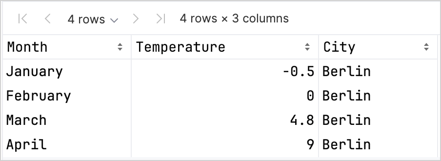
df.head(4)您可以看到資料框有三個欄位:Month、Temperature 和 City。資料框的前四列包含柏林從一月到四月的溫度記錄:
要使用 LPK 程式庫建立繪圖,您需要將資料 (df) 轉換為以鍵值對形式儲存資料的 Map 型別。您可以使用 .toMap() 函式輕鬆地將資料框轉換為 Map:
val data = df.toMap()建立散佈圖
讓我們使用 LPK 程式庫在 Kotlin Notebook 中建立一個散佈圖 (scatter plot)。
將資料轉換為 Map 格式後,使用 LPK 程式庫中的 geomPoint() 函式來產生散佈圖。您可以指定 X 軸與 Y 軸的值,並定義類別及其顏色。此外,您還可以根據需求自訂繪圖的大小和點的形狀:
// 指定 X 軸和 Y 軸、類別及其顏色、繪圖大小和繪圖類型
val scatterPlot =
    letsPlot(data) { x = "Month"; y = "Temperature"; color = "City" } + ggsize(600, 500) + geomPoint(shape = 15)
scatterPlot
結果如下:

建立箱形圖
讓我們在箱形圖 (box plot) 中視覺化資料。使用 LPK 程式庫中的 geomBoxplot() 函式產生繪圖,並使用 scaleFillManual() 函式自訂顏色:
// 指定 X 軸和 Y 軸、類別、繪圖大小和繪圖類型
val boxPlot = ggplot(data) { x = "City"; y = "Temperature" } + ggsize(700, 500) + geomBoxplot { fill = "City" } +
    // 自訂顏色
    scaleFillManual(values = listOf("light_yellow", "light_magenta", "light_green"))
boxPlot
結果如下:

建立 2D 密度圖
現在,讓我們建立一個 2D 密度圖 (2D density plot) 來視覺化一些隨機資料的分佈與濃度。
為 2D 密度圖準備資料
匯入相依性以處理資料並產生繪圖:
kotlin%use lets-plot @file:DependsOn("org.apache.commons:commons-math3:3.6.1") import org.apache.commons.math3.distribution.MultivariateNormalDistribution關於將相依性匯入 Kotlin Notebook 的更多資訊,請參閱 Kotlin Notebook 文件。
在您的 Kotlin Notebook 中貼上並執行以下程式碼片段,以建立 2D 資料點集合:
kotlin// 為三個分佈定義共變異數矩陣 val cov0: Array<DoubleArray> = arrayOf( doubleArrayOf(1.0, -.8), doubleArrayOf(-.8, 1.0) ) val cov1: Array<DoubleArray> = arrayOf( doubleArrayOf(1.0, .8), doubleArrayOf(.8, 1.0) ) val cov2: Array<DoubleArray> = arrayOf( doubleArrayOf(10.0, .1), doubleArrayOf(.1, .1) ) // 定義樣本數量 val n = 400 // 為三個分佈定義平均值 val means0: DoubleArray = doubleArrayOf(-2.0, 0.0) val means1: DoubleArray = doubleArrayOf(2.0, 0.0) val means2: DoubleArray = doubleArrayOf(0.0, 1.0) // 從三個多變量常態分佈產生隨機樣本 val xy0 = MultivariateNormalDistribution(means0, cov0).sample(n) val xy1 = MultivariateNormalDistribution(means1, cov1).sample(n) val xy2 = MultivariateNormalDistribution(means2, cov2).sample(n)在上述程式碼中,
xy0、xy1和xy2變數儲存了包含 2D (x, y) 資料點的陣列。將您的資料轉換為
Map型別:kotlinval data = mapOf( "x" to (xy0.map { it[0] } + xy1.map { it[0] } + xy2.map { it[0] }).toList(), "y" to (xy0.map { it[1] } + xy1.map { it[1] } + xy2.map { it[1] }).toList() )
產生 2D 密度圖
使用上一步中的 Map,建立一個 2D 密度圖 (geomDensity2D),並在背景中加入散佈圖 (geomPoint),以便更好地視覺化資料點和離群值。您可以使用 scaleColorGradient() 函式來自訂顏色刻度:
val densityPlot = letsPlot(data) { x = "x"; y = "y" } + ggsize(600, 300) + geomPoint(
    color = "black",
    alpha = .1
) + geomDensity2D { color = "..level.." } +
        scaleColorGradient(low = "dark_green", high = "yellow", guide = guideColorbar(barHeight = 10, barWidth = 300)) +
        theme().legendPositionBottom()
densityPlot
結果如下:

下一步
- 在 Lets-Plot for Kotlin 文件中探索更多繪圖範例。
- 查看 Lets-Plot for Kotlin 的 API 參考資料。
- 在 Kotlin DataFrame 和 Kandy 程式庫文件中了解如何使用 Kotlin 轉換和視覺化資料。
- 尋找有關 Kotlin Notebook 用法與主要功能的更多資訊。